2. Getting around
The five tabs
The bar along the bottom never changes. Everything in the app lives behind one of these five tabs.
| Tab | What you do there |
|---|---|
| Home | Log pain and medication, and see one day at a time. |
| Plan | Set up medications, appointments, activities and pain actions. |
| Month | The colour calendar, day details and exporting. |
| Trends | Charts and insights over 7, 30 or 90 days. |
| Options | Language, theme, security, backup, help. |
The Home screen
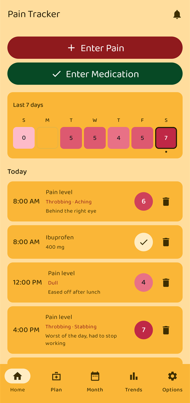
From top to bottom:
- The bell (top right) opens a single list of every reminder that is currently active — see chapter 4.
- Enter Pain and Enter Medication are the two things you will tap most often.
- Last 7 days is the week strip. Each day is coloured by its highest pain level that day and shows that number; a day with nothing logged is an empty outline. The day you are looking at has an amber ring, and a small dot marks today. Tapping the strip opens the Month view.
- Today (or the date, if you have moved) heads the list of that day's entries.
Swipe left and right anywhere on the day list to move between days. Swiping right goes back in time, swiping left comes forward.
As you swipe back the strip follows a week at a time, and its heading changes from Last 7 days to the date range it is showing. A Today button appears beside the heading to bring you straight back.
Entries, doses and suggestions
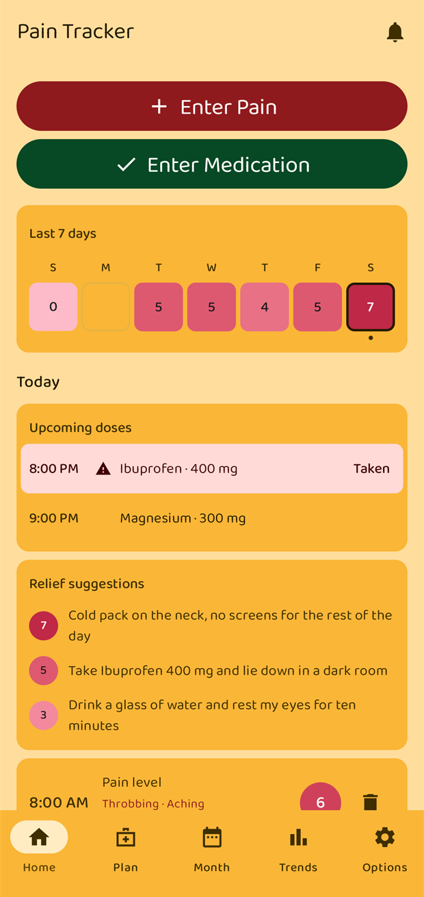
Above the entry list you may see two cards:
- Upcoming doses — medication doses that are due soon or overdue. An overdue dose is highlighted with a warning triangle. Tap Taken to log the intake right there. How far ahead doses appear is set in Options → Home screen → Upcoming doses; missed doses are always shown.
- Relief suggestions — whatever you wrote in your pain actions for the levels you have reached today. See chapter 7.
Each row in the entry list shows the time, what it was, and a coloured badge with the level. The bin icon on the right deletes that row (it asks first).
The pain scale and its colours
Levels run from 0 (no pain) to 10 (the worst). The same colour is used for a level everywhere in the app — the week strip, the month calendar, the charts and the exported PDF — so a shade always means the same thing.
The ramp goes from pale pink at the bottom to deep maroon at the top. Levels 0 and 1 share the lightest shade on purpose: "nothing" and "barely anything" should not look like different amounts of pain. From level 6 upwards the number is printed in white so it stays readable.
| Level | 0–1 | 2 | 3 | 4 | 5 | 6 | 7 | 8 | 9 | 10 |
|---|---|---|---|---|---|---|---|---|---|---|
| Shade | palest pink | ↓ | ↓ | ↓ | ↓ | ↓ | ↓ | ↓ | ↓ | deep maroon |
Brightness carries the meaning rather than hue, so the scale still reads correctly with colour vision deficiencies and in black-and-white printouts.
Light and dark
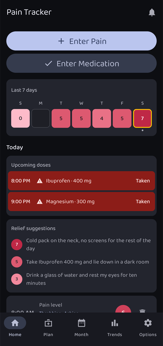
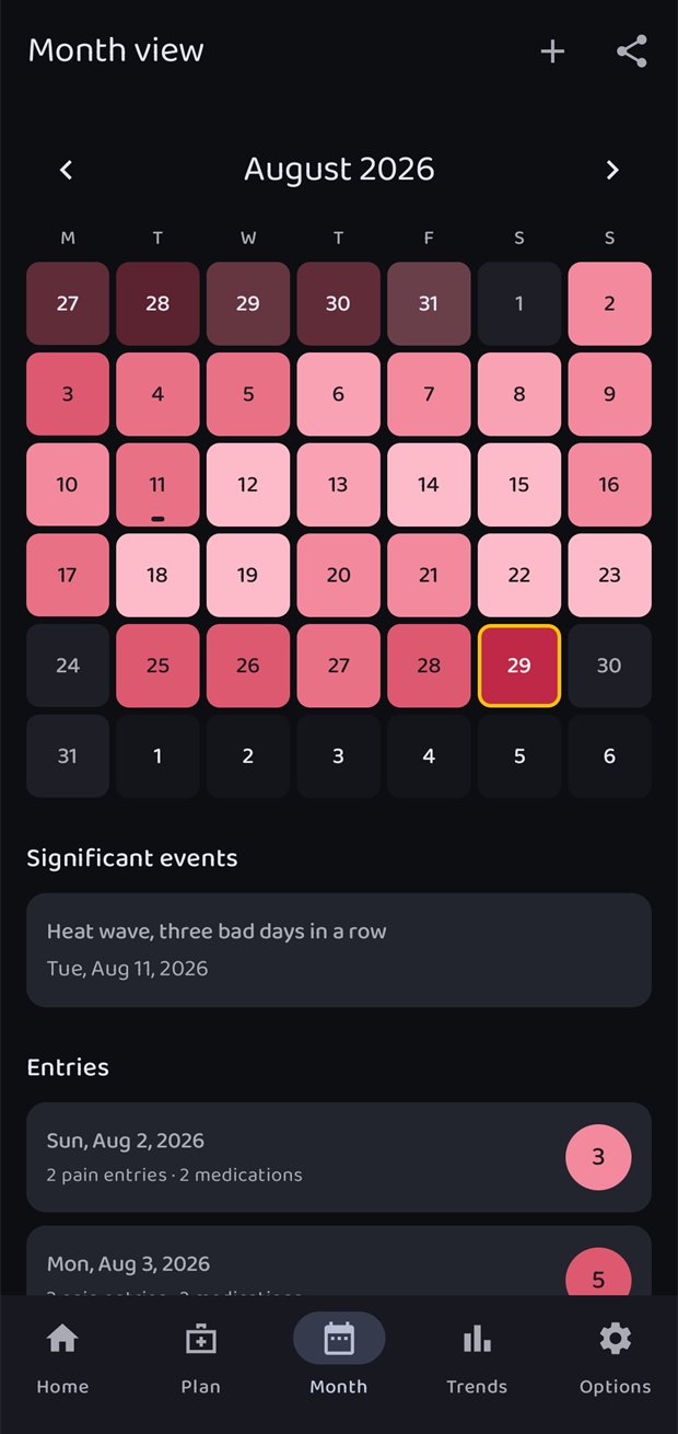
The app has its own theme setting, independent of the phone. Change it under Options → Appearance. The pain colours are the same in every theme.