9. Trends and insights
The Trends tab turns the diary into charts. Nothing here is a diagnosis — it is a way of noticing things you would otherwise have to remember.
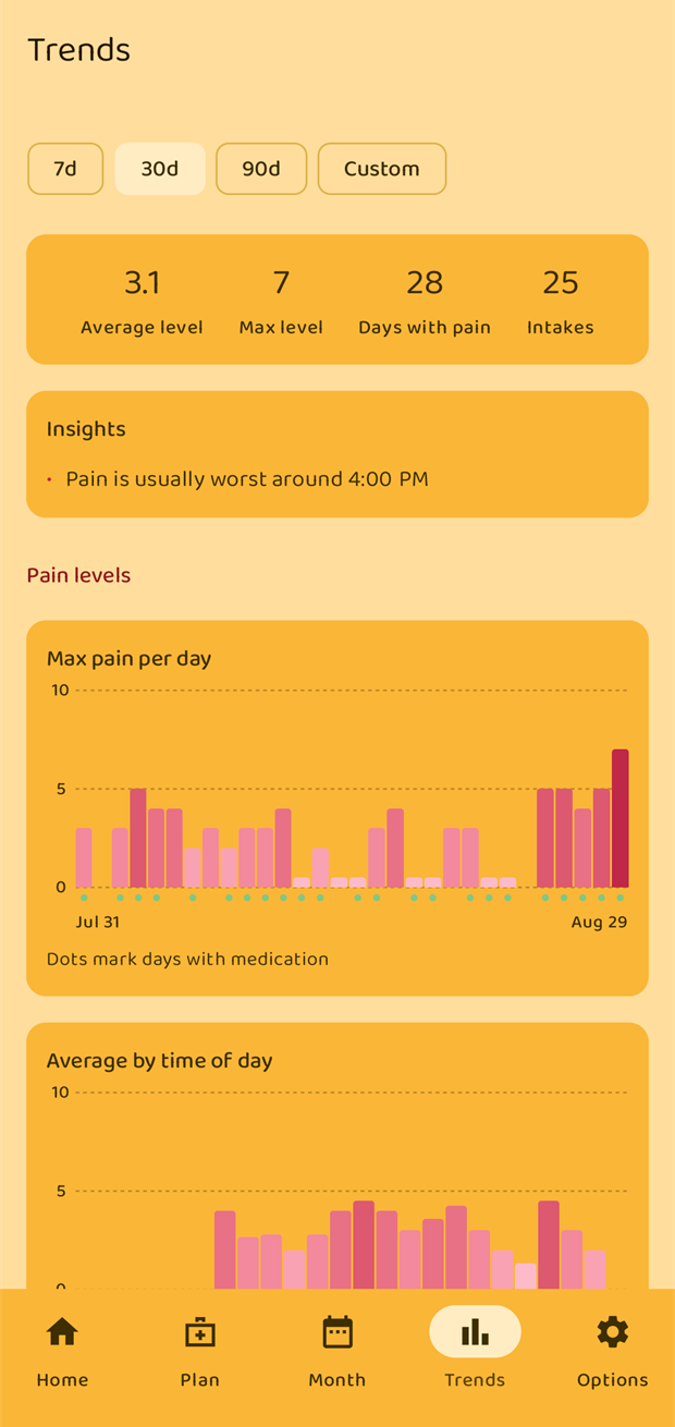
Choosing a period
Four chips at the top pick the period:
| Chip | Period |
|---|---|
| 7d | The last 7 days |
| 30d | The last 30 days |
| 90d | The last 90 days |
| Custom | Any three-month window |
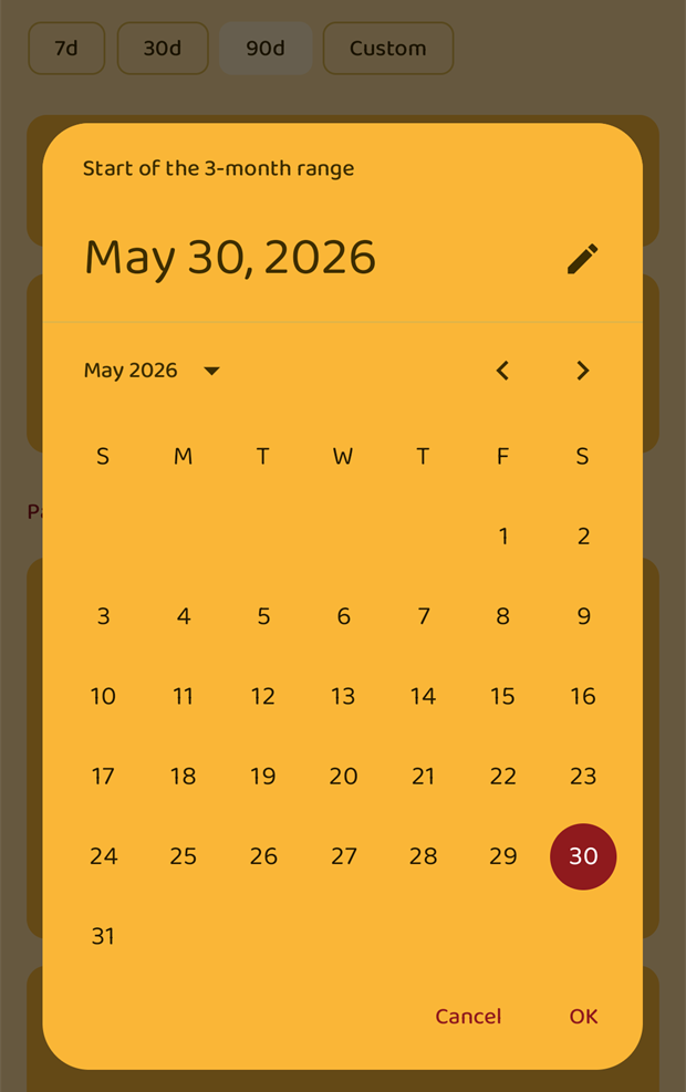
Custom asks for the start of the range and always covers three months from there. Use it to look at a specific season, or the three months before a treatment changed.
The summary
Four numbers for the chosen period:
- Average level — the mean of every entry.
- Max level — the worst single entry.
- Days with pain — how many days in the period have at least one pain entry, whatever the level. A day you logged as 0 counts as a logged day.
- Intakes — how many medication intakes were logged, counting only medications with Include in reports switched on.
Insights
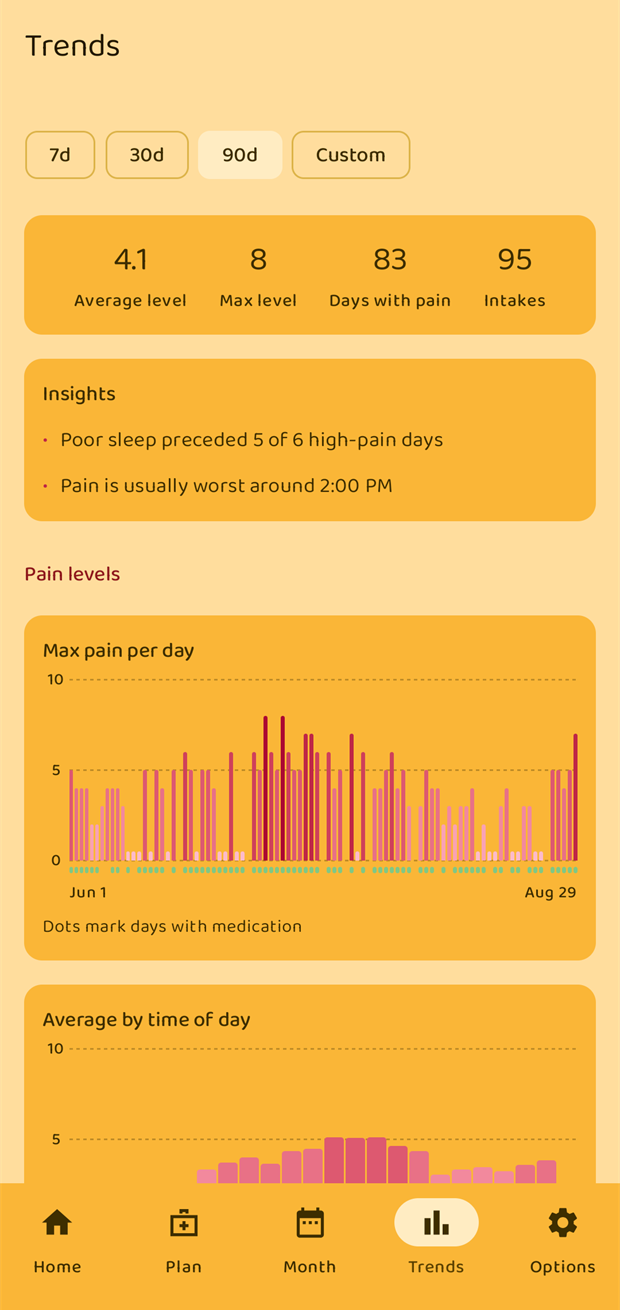
When there is enough data, the app points out things it can see in it, such as:
- "Pain is usually worst around 4:00 PM"
- "Poor sleep preceded 5 of 6 high-pain days"
- "Pain tends to be higher on weekdays" (or on weekends)
These are observations about your own entries, nothing more. They appear and disappear as the period and the data change.
The charts
Pain levels
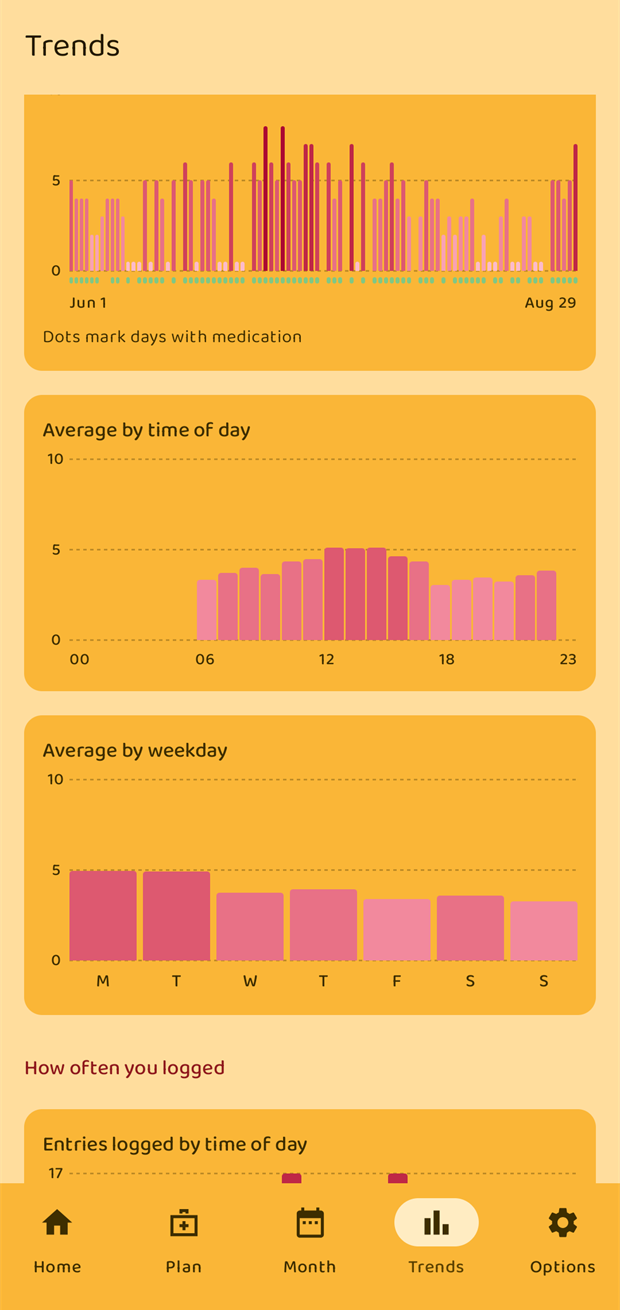
- Max pain per day — one bar per day, coloured by level. The small dots underneath mark the days you took medication (only for medications with Include in reports switched on).
- Average by time of day — the average level for each hour of the day, 00 to 23. This is the chart that shows whether your pain has a daily rhythm.
- Average by weekday — the average level for each day of the week, Monday to Sunday.
How often you logged
The same two breakdowns, but counting entries rather than averaging levels: Entries logged by time of day and Entries logged by weekday. They are a check on the charts above — an hour with a high average but only two entries behind it means less than one with fifty.
Most common
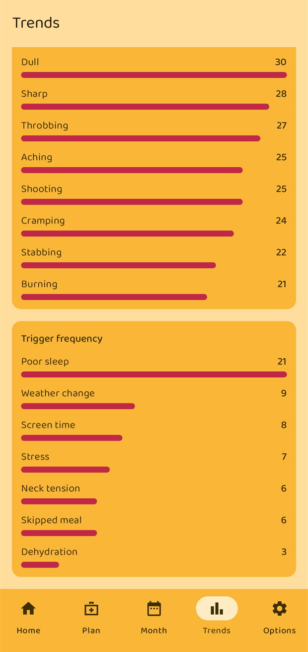
- Pain type frequency — how often each quality (throbbing, stabbing, …) appears, most common first.
- Trigger frequency — the same for your triggers.
When there is nothing to show
Until you have entries in the chosen period the screen simply says "No entries in this period yet." Try a longer range.